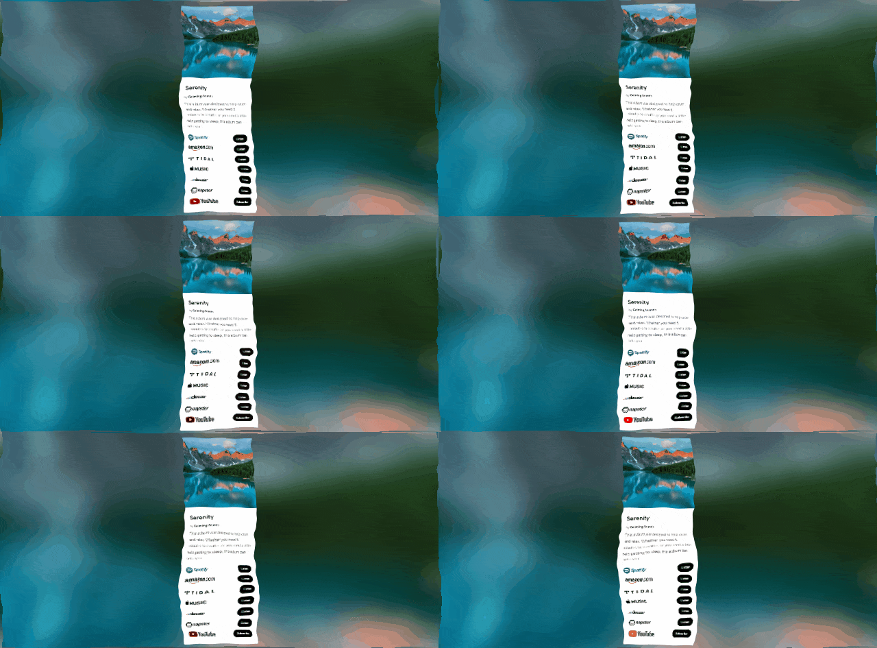
Whether you’re a musician, brand, creative, influencer or business. You should really have a Smart Link that contains all relevant URLs under one roof. They speak for you and help massively with promotional material. It’s one thing making a Smart Link, but how do you make sure it sells itself?

PUSH offers multiple landing page templates. Depending on your product or service, we have a Smart Link set up that will suit. You can add as many or as few links as you want. It’s completely your choice. If you’re a music artist, you might have lots of links because you may have released your work to multiple stores. Alternatively, if you’re a small business, you might only have a few. Perhaps you have social media accounts and then a link to your Etsy where you sell your work. Smart Links are there to be designed around you. With PUSH, you can customise your logos, URL, add artwork, descriptions and artist names. Our aim is to make it as personalised to your style as possible. There are a few ways you can boost this even further to get the most out of your landing page.
Consider your goal

What do you want to achieve from your landing page? It’s the first place people will see when they click on your link. If it doesn’t draw them in or explain to them why they should continue looking at your work, then it isn’t useful. You don’t want your page looking bleak and lifeless, because that doesn’t speak well for you as a creative. Think about what you want to gain from your link though. Is it you want to encourage people to purchase from you? Are you setting it up to get more views on one of your social accounts? Or are you simply wanting to spread a message about something? It doesn’t have to be one rule for all. You might not have the same wants or needs as other creators and that’s absolutely fine.
As long as you have a goal in mind when creating your link, it will speak on your behalf. If you go into the creation stages without having thought through your idea, then it’s possible you’ll need to go back and make changes further down the line. Don’t panic though. PUSH allows you to make all the changes you need at any stage without having to remove your link and start again. Ensure you have a goal you can measure. For example, if you’re wanting to gain more followers on your social media account, you can check on this. You can easily monitor your growth.
But, if you were to set your goal as something as vague as just performing well, how can you monitor this? How can you measure how well you are performing? There has to be something you are measuring. Is it statistics and figures? Are you looking at numbers of followers, listeners or viewers? Is it perhaps sales that matter the most to you currently? Think about specific elements you want to measure to make things more streamlined. With a goal in mind, it is harder to go off track. You can also then focus on your next steps. Think about where you want to move next. If your Smart Link is working for you, or if you need to make changes.
Keep your branding consistent

Think of your brand at all times. When it comes to tone of voice, make sure it matches how you usually word things. It isn’t a requirement within a PUSH landing page to include a description, however there is an option to. It might be that you want to explain your link briefly, or thank people for checking your content out. If this is the case, consider your normal tone of voice. How do you speak to people within emails, on social media and in your other promotion? Make it consistent, so they build up the right idea of your company or you as an individual. When it comes to sharing your links, you’ll want to present them with the same voice as that contained within the links.
Consider your colour schemes. If you have a particular style to your work, you can create your own logos. No matter whether you’re adding links to a website you have built yourself, or if you’re adding in music links to places like Spotify and Deezer. If you decide you don’t want to include the normal links these companies use, you can create your own. Simply add your own image logos in to fit in with your brand style. Think about what artwork you want to use. If you’re a company that wants to be bright and colourful, make sure your artwork is. The background of your landing page will be a blown up softer version of your artwork. So, if your angle is bright colours, don’t pick black artwork.
Think about your audience

Remember, just because something is your style, doesn’t mean it is for everyone. Of course, if we’re going back to branding it might be that you are your brand. Being a musician or influencer means you are what you are promoting. So, your colour schemes and artwork will be very personal to you and your preferences. That’s fine because you’ll attract people with similar likes and interests. However, if you’re perhaps a law firm, and you’re creating a landing page highlighting your website, contact details, social pages etc. you can’t make it all about you. Your favourite colour might be red, you might enjoy football. These aren’t things that will necessarily interest potential clients.
Red means danger usually. That’s not what you want from a law firm. Who cares if you like sports or not, right? That isn’t what your audience are reaching out to you for. So, posting artwork of you in a football kit isn’t going to drive sales. You need to have your audience at the front of your mind on all occasions. Think about how easy your landing pages are to navigate. Do they have all the relevant information? Remember, they’re supposed to be a one-stop shop. So, if you fail to include really important links or information, you’re going to potentially lose interest. People don’t want to have to reach out to find out more. They want your landing page to contain everything.
Think globally

If you’re a brand or business that only sell within your own country then this section won’t be relevant to you. Often with small brands the costs of shipping and taxes in other countries outweighs the profits, and therefore it doesn’t make sense until you grow to expand outside your homeland. However, if you’re perhaps a musician and your business is in promoting your music within streaming stores, this section will be relevant to you. If you’re appealing to other countries you need to consider your audience’s needs within them. They might be very different to your consumer needs from elsewhere in the world.
Take streaming stores for example. Spotify might be the preferred store within your country, but there are other places around the world who might not have the same access to this platform. Perhaps they have other store preferences. When distributing your music you often have the choice of many music stores to send your tracks to. If you have opted in and selected as many as you can, make sure you’re adding them to your landing page. A platform that isn’t well known within your side of the map might be hugely popular elsewhere. By not adding these links into your URL, you’re cutting off a lot of potential listeners.


