If you’re setting up a brand or starting your marketing for it, you need to think of your colour schemes. Don’t rush into the decision because once it’s made, it’s really hard to change. Colour schemes can help define a brand. But, get it wrong, and you could end up missing out.
The importance of colour schemes
Colour schemes can help identify your brand. Have you ever seen those games where you are required to identify a brand by just parts of its logo? Well guaranteed there are many brands that you can get by just their colours alone. Red and yellow combined. Where does your mind go? McDonald’s, right? An orange/yellow? Amazon’s smile. The primary colours in a circle? Google Chrome. Without even realising we associate certain colours with certain brands. If you want your brand to do well, you’ll need to decide on a colour scheme early on. The more people see your branding with these colours, the more it will click.
They’ll start thinking of these colours when imagining your company. Depending on the colour choice, they might even think of your brand whenever they see the colour. For example, the purple colour of Cadbury’s isn’t used everywhere. So, if you see it out and about, your mind might instantly think of the chocolate company. There are of course reasons as to why they have selected purple as their colour. There’s a lot of psychology behind certain colours. How they make us feel and what they mean. We will dive deeper into this as we go on. But, for now, it’s important you’re aware that solidifying your colour scheme at the very start is something that can only benefit your brand.
Powerful colour schemes
Colours need to work together, rather than against each other. What might look really pretty and compliment your business, might not be the best choice. Your background colours need to work with your font colour choice. You need to ensure your work is easy to read and is powerful in all types of lighting. For example, some people prefer all of their apps to be in dark mode. If your font isn’t going to work in this mode, you’ll lose potential clients.
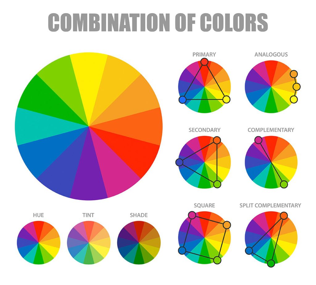
Most colour schemes that are successful are designed with analogous or complementary colours in mind. Analogous are the colours found next to each other on the colour spectrum. For example, you’ll find yellow and orange together. Then you have complementary colours. These are ones that are found opposite each other within the wheel. An example of this is blue and yellow. What does our mind instantly go to? IKEA. Sometimes colours that in our heads clash, actually do well together. They might not be your first choice when it comes to preference. However, having contrasting colours together makes the font stand out and easy to read.
Start with primary colours and work from there
Once you’ve considered the basic colours, it’s time to think about shades. For example, green and red might compliment each other, but if you have bright red and a very pale green, you’re still not going to be able to read the font. This is where you need to think about how bold you want your branding to be. Again this comes down to the type of product or business you’re promoting. If you’re advertising something that needs to be loud, you might go for brighter shades. Whereas, if you’re promoting something that needs to be softer, you might go for more muted tones.
What do you want your colour scheme to say? Red often is loud, fiery and can be aggressive. However, it’s also the colour of love. So, it depends on where you use it, what tone you go for and what colours you pair it with. Blue can be cold. But, it can also be calming. If you’re a solicitors perhaps blue would be favoured over red. You want your potential clients to feel calm when approaching you. They should have a clear head and not be fired up. This is where choosing red my have the wrong effect.
Complimentary colours
Remember, just because you might not pair them together in your wardrobe, doesn’t mean they don’t work well together. The idea isn’t that they blend into each other. You need them to stand apart. Otherwise, no one will be able to read what you have to say. This will negatively affect your branding and will show you haven’t considered your colour scheme properly. It will be a colour scheme you carry throughout. So, ensure you don’t completely hate the colours. Also, make sure you can see yourself printing them into promotional material. It’s one thing on websites, but make sure you’d be ok with seeing them printed on merchandise or business material if needed.
Contrasting colours that compliment each other 


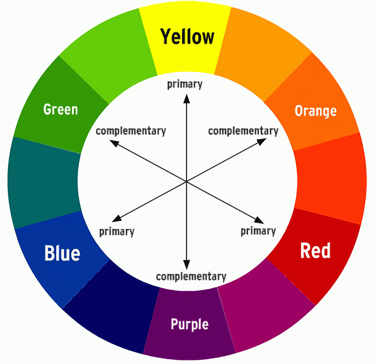
According to the colour charts, both blue and orange and yellow and purple work together. From the images we’ve put together above, you can see that they do work well. The writing clearly stands out against the background, but the colours don’t seem to clash. It isn’t an eyesore. But, at the same time, the colours don’t fade into each other. Often when picking colours that you prefer, you might be tempted to go for ones that match. This is fine if it makes things easy to read. Sometimes though, it can blend so well that you can’t make out the writing.
Colour schemes to avoid
Unfortunately it might often be colours you love together that you should avoid. This of course, is only when it comes to branding. If you want to stand out you need to use colours that won’t blend in easily with each other. Think about your branding from an outsider’s view. It might work for you, but what about those who are colour-blind or visually impaired? If the colours are too similar, they won’t be able to read it. In fact, many conditions such as dyslexia which is extremely common struggle when certain colours are combined.
You might find yourself wiping out huge potential clients, simply because you haven’t thought about your colour scheme from other viewpoints. This is why it’s important to take a professional view of colour schemes. Do some research into the ones that best compliment each other. Read about what different colours mean and why you should avoid certain ones depending on your niche. If you want to include everyone, you will need to consider more than just how it looks at an initial glance. Black can be a tricky colour to master. This is due to what you will place with it. For people who are visually impaired, they may struggle. However, likewise having black text on a white background doesn’t work for many other people.
Colour schemes that are hard to read
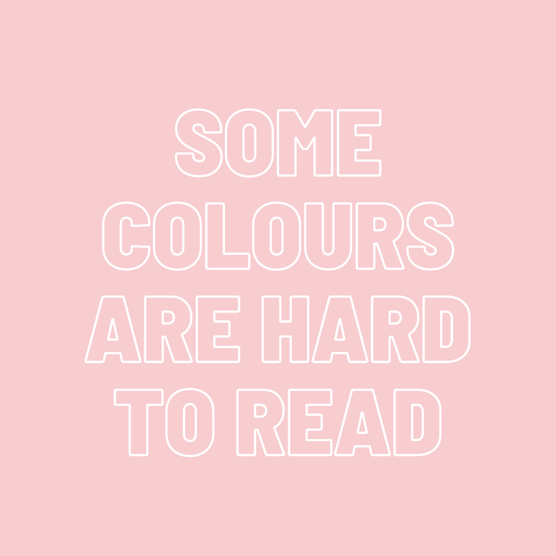
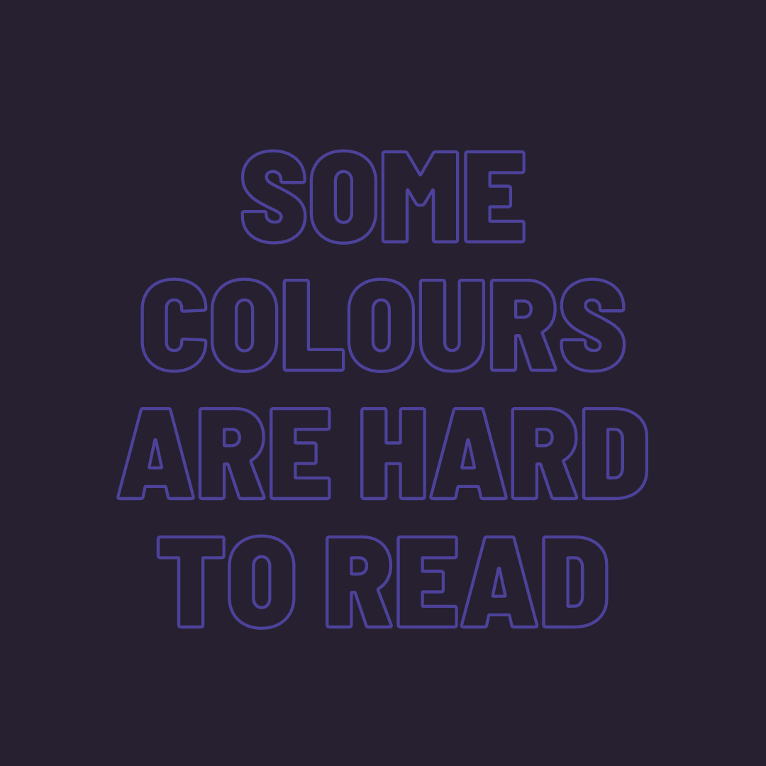
Initially, if you compare these images to the ones previously, sure you might think these look nicer. They do in the sense of the colours match perfectly, and it’s nice to look at. However, imagine a lot of text with these colour combinations. What if we shrink the text size? How easy would the white on the pink and the blue on the black be to read then? Possibly it would still be ok for you. However, for many people, it would be really tricky. The words certainly don’t pop out on the page as they do in the first images. This is where we’d start to reconsider.
Perhaps if you really wanted the pink and white combination, you could consider a different shade of pink? Or, the same with the blue and black. But, this would be something you’d have to trial and error. You’d possibly be best off with various potential clients reviewing your logos first to see if your branding works for them. There’s nothing to say colours that match beautifully can’t work. However, when you’re trying pastel colours, you can’t then go and use a light font and expect everyone to be able to read it. You need to consider perhaps using a font that is on the opposite side of the colour wheel, so it stands out better.
Psychology within colour schemes
When it comes to choosing colours to place within your branding, it’s important to note how they make you feel. How they’ll make your audience feel. What connotations are based around the colours you’ve selected? Certain colours have certain meanings. Some colours can have multiple meanings. In some situations they may be positive. However, in others, they’re not friendly colours. This is something you should consider, not only when picking a colour but also then the shade.
Red
Red is a colour which is often linked to danger. It’s powerful and is thought to get a reaction out of humans. That’s why stop signs are red. They gain a reaction. People see them and react quickly. It’s a colour that has been known to make hearts race. This is because we link it naturally to violence. The colour of blood. Therefore, it’s looked at as a colour that is caused by pain.
Alternatively, red is the colour of love. Due to it being the colour associated with hearts, it’s been widely used for a long time when it comes to romance. With it being a bright, vibrant colour and making people pay attention, it’s also great at gaining attention in a romantic way. Dating back for a long time, red is known as a colour that many women use when applying lipstick. It’s a way of enhancing their beauty. Similar to the beauty associated with red roses. This could suggest that depending on the hue and tones of your red choices and how you use them, red colour work in your favour either way.
Blue
Blue is often an appealing colour. It is known for being relaxing and calming. This is why many huge companies use it within their branding. It is a softer colour. No matter the shade or tone, it isn’t known for aggression. Facebook, LinkedIn and Twitter all use various shades of blue within their logos. It’s a very common choice. If you’re a solicitor you might want to consider using blue within your branding. It offers reassurance and suggests loyalty. You can build trust through a calming colour like blue.
It is thought that blue is the opposite of red when it comes to feelings. While red increases blood pressure and feelings of anger. Blue reduces it and makes people feel calm. Due to it being so calming, it is suggested that customers are less likely to be bothered by small errors. Site speed and general lag is less likely to irritate consumers when they’re looking at calming colours. It links with nature, the sky and ocean. Both of which are known for their calming natures.
Yellow
Yellow is known for its connection to the sun. It’s a bright, warm and happy colour. When you see smiley faces, they’re always yellow. Children’s happy cartoon characters are often yellow. So, we’re taught from a young age that yellow is a colour we can trust.
It has an alternative side, however. Yellow is also the colour of wasps, warning signs etc. It can be linked to danger. But, when you break it down, it is often linked to warnings of danger. It’s letting you know that there could be an unpleasant situation presented to you. This way, you can avoid it before it happens.
Green
Green can mean different things depending on its tone. Often it’s associated with nature and is therefore calming. Darker tones can suggest wealth and status. It’s also linked to health. You see the green plus symbol at every pharmacy. It’s showing green as a restoration to health.
Green acts as a bridge between warm and cool colours. It can be a bit of both depending on the tonal choices. Typically, it’s more of a cold colour, therefore it has similar calming effects as blue. Using green can calm customers but also suggest financial growth. This could be a brilliant colour choice depending on the business.