As well as providing DIY marketing tools, PUSH also hands you invaluable insights into how your fans interact with your content. Read on to learn more about these indispensable stats and figures.
Overview
Today’s Campaign Performance
When you log in to your PUSH.fm account, you’ll be presented with an overview of all of your campaign’s performances:
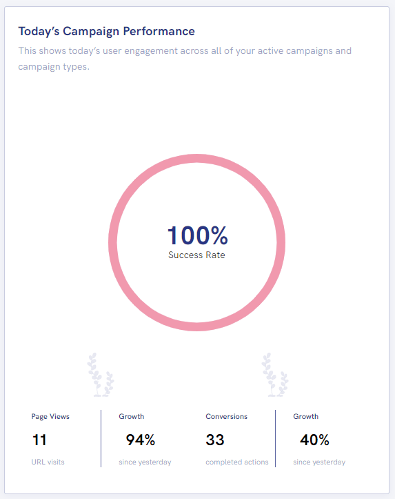
 The pink progress circle represents the overall success rate of all of your campaigns. The more conversions you get across your campaigns, the higher this rate will be.
👀 The page views show the combined total of everyone who’s viewed all of your landing pages across all of your campaigns.
 Conversions show how many of your fans have clicked on your links within your landing pages. The higher your conversions the better; this means fans are actively seeking out and wanting to access your content.
 The growth percentage shows you how your campaigns are performing in comparison to the day before. This is a great statistic to see how recent campaigns are performing at a glance.
If your growth is low, or a negative percentage, don’t worry! This could be because the majority of your campaigns are outdated, or that you haven’t had any interactions today.
Fan Link Performance
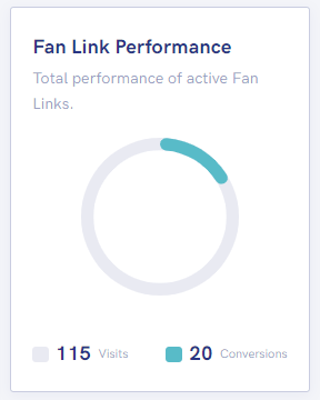
 Fan Link performance is very much self explanatory. Here you’ll see how all of your Fan Links are performing.
Progress chart – The more blue within your circle, the better your visit to conversion ratio, and the more successful your Fan Links are.
If your progress chart is mainly grey, this means your Fan Links aren’t getting many conversions. Try making your Fan Links more eye-catching, and including more content links to ensure your fans’ preferences are being catered to.
Pre-save Performance
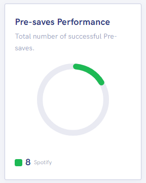
 Your Pre-save progress chart shows you how many pre-saves have been made and which stores they’ve been pre-saved on.
The example on the rights shows that all our Pre-save campaigns collectively have received 8 pre-saves on Spotify and no other stores.
The less grey you see in this progress chart, the better; this means your campaigns are performing well and a good amount of people are clicking on your Pre-save campaign with intent.
Content Unlock Performance
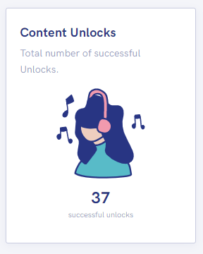
 The final square in your overview shows how many successful unlocks have been completed from all of your Content Unlock campaigns. This means your fans have clicked on your Content Unlock link, completed the required social actions and unlocked their reward.
Top Performing Campaigns
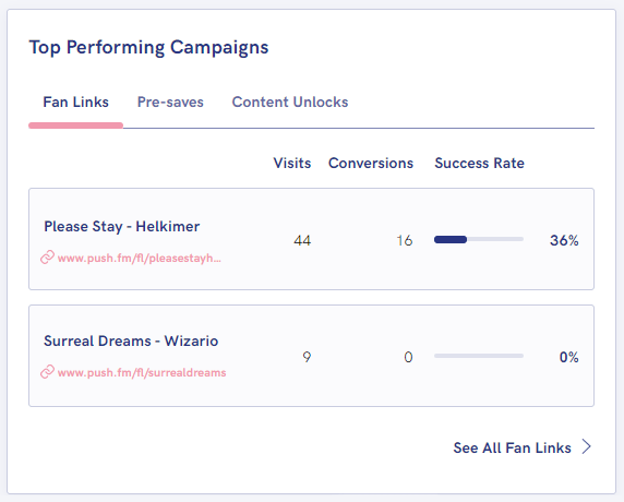
 The final section in your dashboard overview shows you a breakdown of your top performing individual campaigns.
This offers you a quick and easy insights into the visits, conversions and success rates of your various campaigns.
If your success rates are lacking, look back at how you can improve the visual aspects of your campaigns. Strong, eye-catching and professional looking landing pages are guaranteed to entice users in before they’ve even read what links you’ve included.
Your PUSH.fm dashboard is invaluable at giving you an easy-to-read breakdown of how your marketing campaigns are performing as a whole.
If your campaigns aren’t performing as expected, don’t be disheartened. See it as an opportunity to learn and try out new things!
To jump on the marketing bandwagon, head over to PUSH.fm and create an account for free now.