Colour theory is an essential tool for artists, designers, and anyone looking to use colour intentionally. At the core of colour theory is the colour wheel, a circular diagram that organises colours in a way that visually represents their relationships.
Whether you’re a beginner or looking to refine your skills, mastering the colour wheel can transform your approach to creating visually appealing designs. Here’s a comprehensive guide to understanding and using the colour wheel effectively.
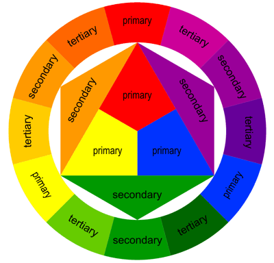
What is the colour wheel?
The colour wheel is a representation of the spectrum of colours arranged in a circle. It is divided into three main categories:
- Primary colours: Red, blue, and yellow. These are the foundational colours that cannot be created by mixing other colours.
- Secondary colours: Green, orange, and purple. These are created by mixing two primary colours.
- Tertiary colours: These are formed by mixing a primary colour with a secondary colour, such as red-orange or blue-green.
The arrangement of these colours helps illustrate relationships, such as complementary, analogous, and triadic colour schemes.
How to use the colour wheel
1. Identify complementary colours
Complementary colours are located opposite each other on the colour wheel, such as red and green or blue and orange. These pairs create high contrast and vibrant designs when used together. Complementary colour schemes are popular in logos, advertisements, and digital designs to grab attention.
2. Explore analogous colours
Analogous colours sit next to each other on the colour wheel, such as blue, blue-green, and green. These combinations create a sense of harmony and are often used in designs that aim for a cohesive and calming effect. Analogous schemes work well for backgrounds, branding, and interior design.
3. Experiment with triadic colours
Triadic colour schemes involve three colours evenly spaced around the colour wheel, such as red, blue, and yellow. This approach balances contrast and harmony, resulting in bold yet cohesive visuals. Triadic schemes are ideal for designs that need to stand out while maintaining balance.
Tips for using the colour wheel effectively
- Start with a purpose: Before choosing colours, define the mood or message you want to convey. Warm colours like red and yellow evoke energy, while cool colours like blue and green promote calmness.
- Use tools and apps: Many digital tools, such as Adobe Colour and Coolors, can help you create colour palettes based on the colour wheel.
- Experiment and adjust: Don’t be afraid to mix and match colours to see what works best for your project. Trust your instincts and tweak combinations as needed.
The colour wheel is more than just a tool; it’s a gateway to understanding the science and art of colour relationships. By learning how to use it effectively, you can create designs that are visually appealing and emotionally impactful. Whether you’re working on a branding project, painting, or designing a website, the colour wheel can guide your choices and elevate your creativity.