YouTube Music users have argued the buttons for shuffling music and repeating the last track aren’t all that obvious. The music platform listened and have made a few minor changes.

Who knew that simple buttons could cause so much controversy? Well, it has for YouTube Music, anyway. It seems users were unable to be completely sure as to when the repeat or shuffle buttons were active, due to their design.
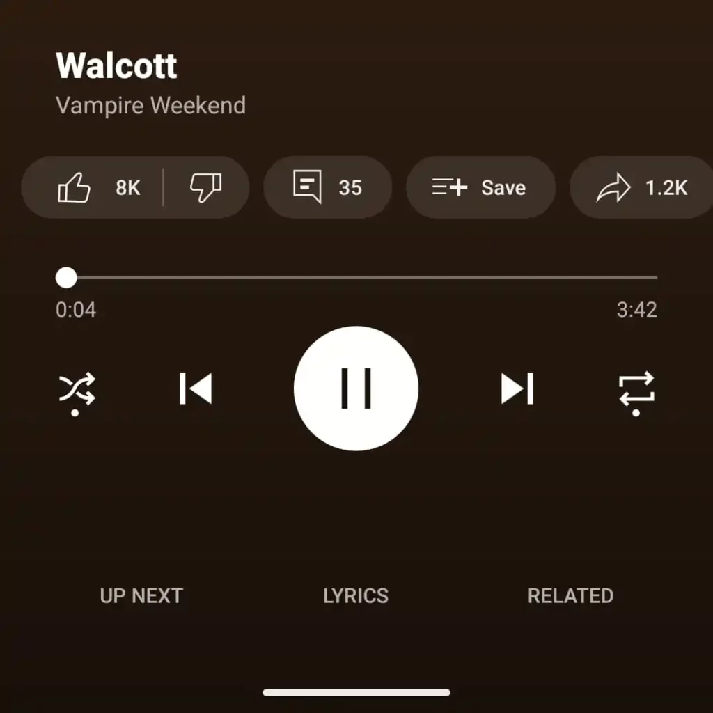
Due to the buttons themselves being thin, white lines, it was hard for some users to be sure they were in use. The buttons did become slightly more bold when pressed, however, many found themselves circling through pressing them again and again to be sure.
YouTube listened to the complaints and have now acted on it. They have changed the features, so there is now a white dot that appears underneath, only when the button has been pressed. This should clear up any confusion.
It seems the update hasn’t completely been rolled out yet, but those on 8.26 Android are able to see it. We’d imagine more users will see it soon. Simple changes can make a huge difference to user experiences so they are important for platforms to focus on.