When you’re just starting out as a musician, your sound is your foundation — but your visuals are what help people remember you. A great logo, consistent artwork, and a recognisable style make your music feel professional and cohesive.
The good news is, you don’t need expensive design software or a big budget to create something that stands out. With a few smart tools and a bit of creativity, you can build a visual identity that truly represents you and your sound.
1. Why your visuals matter
Your logo and visuals are often the first thing people see before they hear your music. They appear on your social media, streaming platforms, and even your PUSH.fm Smart Links. Having a consistent look makes your brand memorable and helps potential fans recognise your work instantly.
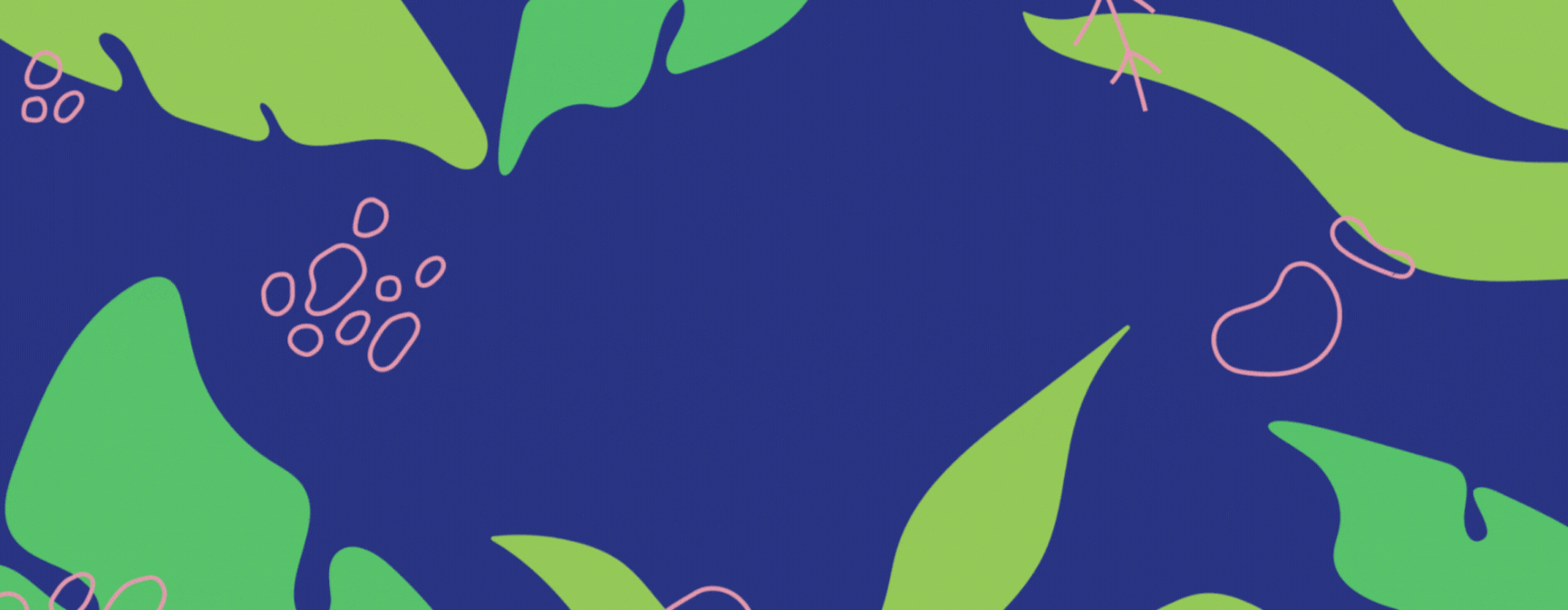
Think of your visuals as part of your storytelling. If your music is dark and moody, your imagery should reflect that. If your songs are bright and upbeat, your colours and designs should match that energy.
2. Start with your artist identity
Before you jump into designing, take a moment to define what your artist identity is. Ask yourself:
- What emotions or messages does my music convey?
- Who is my audience?
- What colours or symbols feel like “me”?
These answers will guide your design choices and help you stay consistent. Create a small “mood board” — a collection of colours, fonts, photos, and shapes that capture your vibe. You can use free tools like Pinterest, Milanote, or even Canva to do this.
3. Design your logo for free (or very cheap)
You don’t need a professional designer to make your first logo. Free design tools make it easy to experiment until you find something you love.
Try these:
- Canva – simple, free, and packed with templates perfect for musicians.
- Adobe Express – beginner-friendly with high-quality results.
- Looka or Hatchful by Shopify – quick AI-based logo makers for instant ideas.
When designing, focus on simplicity. Your logo should be easy to read at any size — whether it’s on a streaming profile, a poster, or your PUSH.fm link. Avoid clutter and fancy effects. Often, a clean font and one strong symbol are all you need.
Pro tip: Choose a font that’s unique but legible. Stick to one or two colours that reflect your brand’s energy.
4. Create matching visuals for your releases
Once you’ve got your logo, expand your look across all your platforms. This means using the same colour palette, typography, and style in your:
- Cover art
- Social media banners
- PUSH.fm Smart Links
- Press photos
- Merch designs (if you have them)
You can use free templates on Canva or Adobe Express to keep everything consistent. If you’re shooting photos or videos, pay attention to lighting and tone — even smartphone cameras can produce amazing results with the right composition.
5. Keep consistency across platforms
Consistency builds trust. When your audience sees the same logo, fonts, and colours on your Spotify profile, Instagram page, and Smart Links, they instantly know it’s you.
Use your PUSH.fm Smart Link as a visual hub — customise the background, add your logo, and use matching colours to tie your branding together. This helps your whole online presence feel polished, even if you’ve done it all yourself.
6. Evolve as you grow
Your first visuals don’t have to be perfect — they just need to represent where you are right now. As your sound develops, your visual identity can evolve too. Many artists refresh their logos and colours over time to reflect their growth.
When you’re ready, you can invest in professional design — but by starting small and learning the basics yourself, you’ll already understand what makes your brand work.
Creating your first artist logo and visuals on a budget isn’t about spending money — it’s about being resourceful and consistent. Use free design tools, stay true to your identity, and make sure everything you create feels connected.
Your visuals are an extension of your music. With the right approach, you can build a brand that looks professional, tells your story, and helps new listeners take you seriously from the very first glance.